Necodex Homepage
Experience the transformative redesign of Necodex website: a modern, user-friendly interface that enhances navigation and engagement.
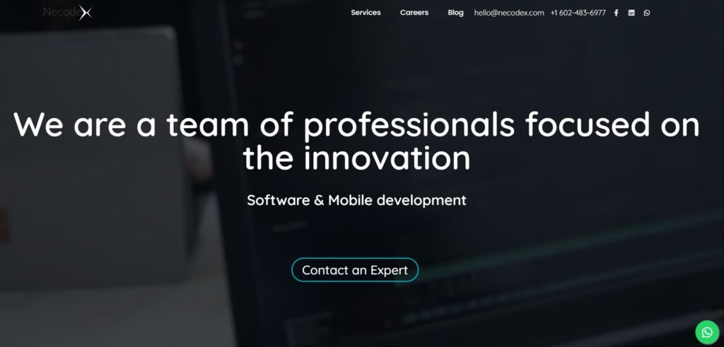
OLD NECODEX
I recently took charge of the Necodex team and realized that while the old site was helpful, it was in dire need of a revamp. Focusing on visual appeal, functionality, and performance, I spearheaded a necessary overhaul to elevate the website to new heights.
ACTUAL NECODEX
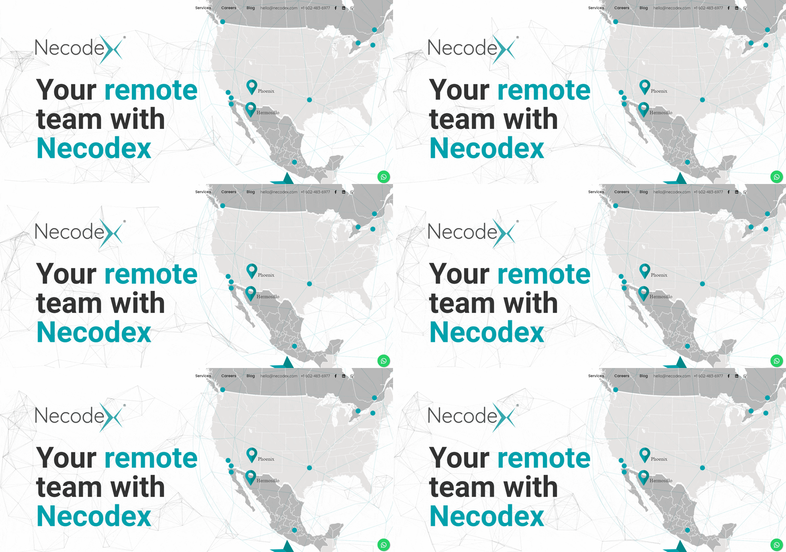
I recently revamped the Necodex website, bringing a fresh new look to the forefront. By replacing the dark gray with a predominant white color scheme, the design now radiates elegance. I also paid special attention to our classic turquoise blue, incorporating vibrant details that invigorate the user experience.***
***The page is experimenting new changes so this one may have some different visual details.
Comparisons
Next, I will outline some key differences between the old and redesigned sections.
On the left side, we have the old section, while on the right side, we showcase the new section.
Core characteristics
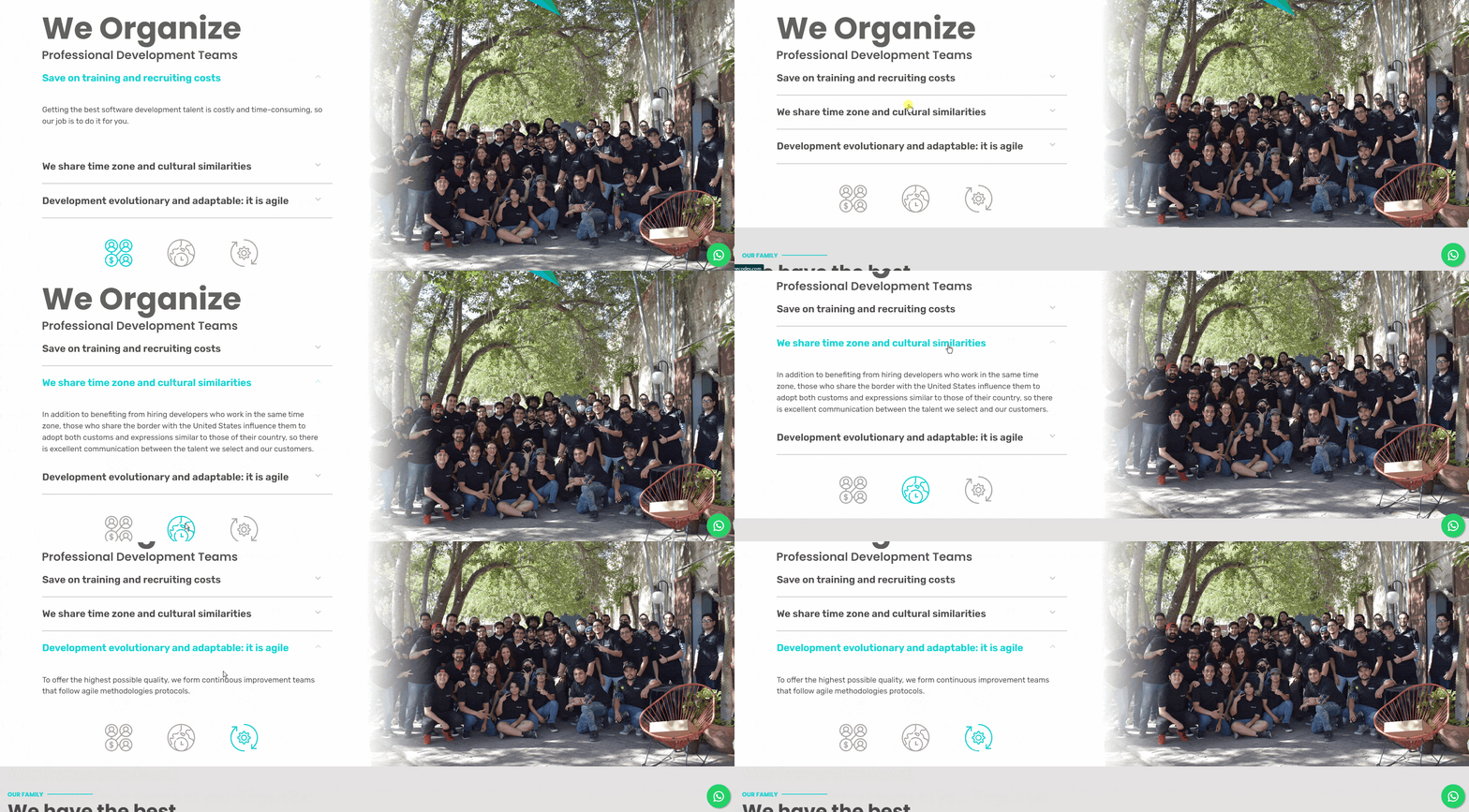
In this section, I made significant improvements to the usability and visuals. I implemented an accordion feature that neatly organizes our core characteristics, allowing users to expand only the tabs they want to read, resulting in a cleaner and more user-friendly interface. Additionally, I incorporated JavaScript code that dynamically illuminates the respective icon in accordance with the selected tab, enhancing the overall interactivity and visual appeal of the section. These enhancements contribute to an enhanced user experience, making information easily accessible while adding a touch of modernity to the website.
Services
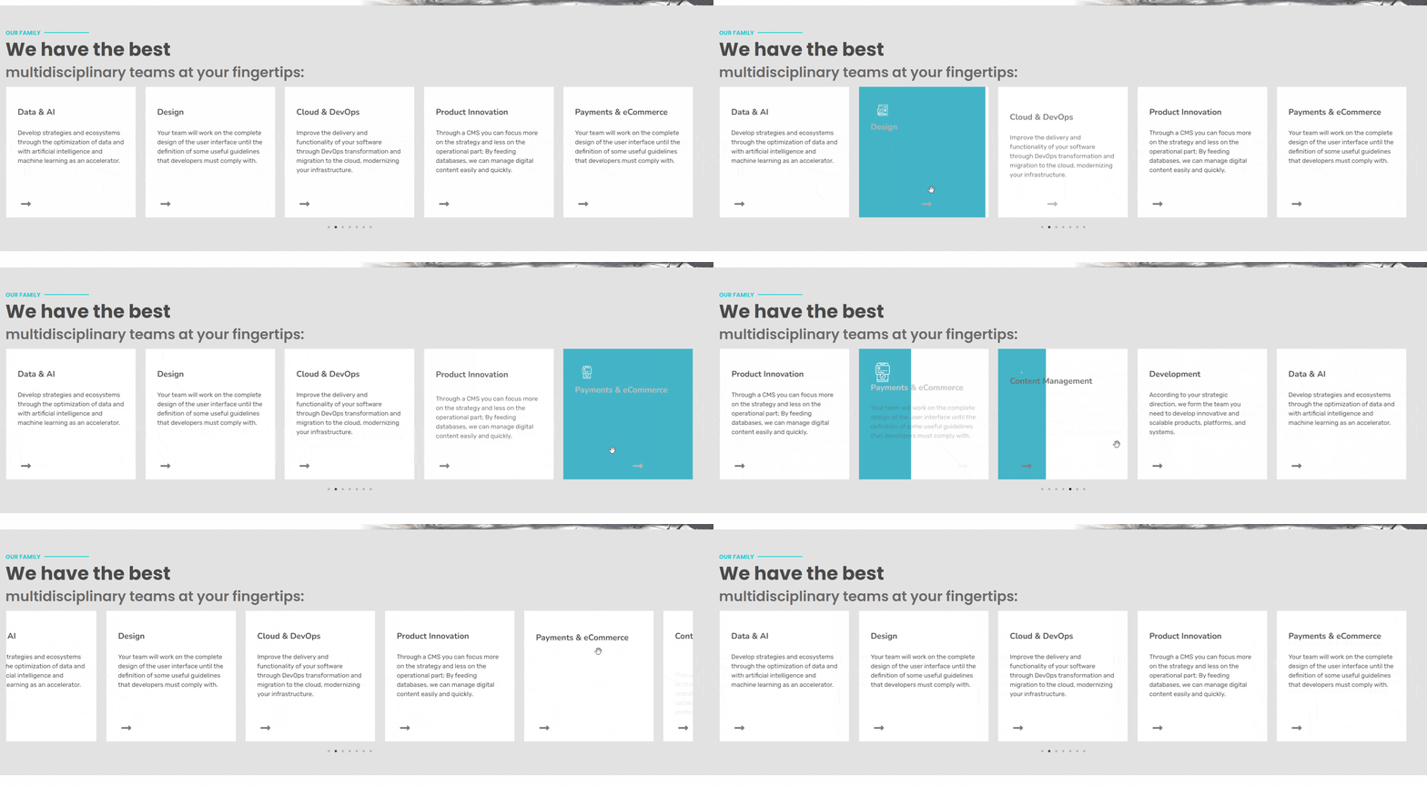
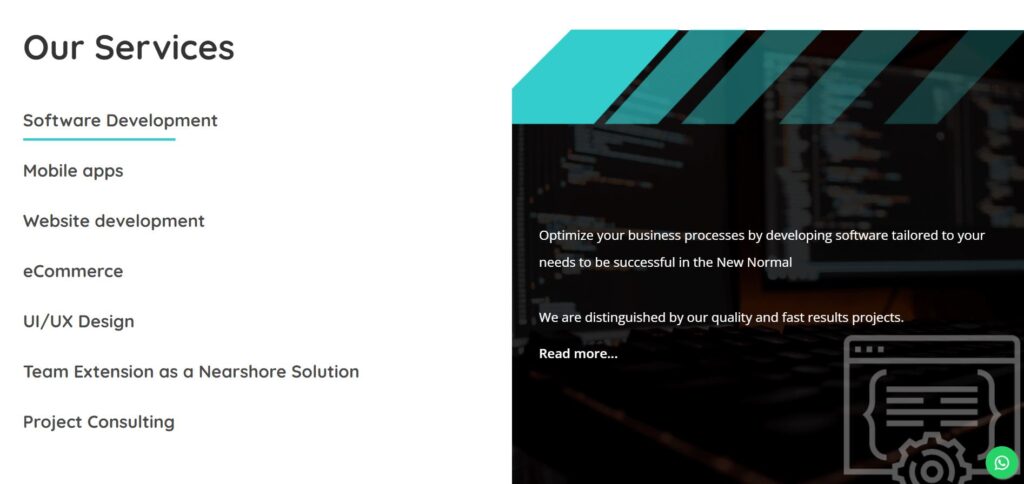
In the services section, I leveraged the power of Bootstrap to enhance certain elements. Implementing a sleek horizontal slider with a minimalist design, I utilized Bootstrap’s responsive framework for seamless compatibility across devices. Additionally, I employed Bootstrap’s CSS classes and components to ensure consistent styling and efficient development. This combination of Bootstrap and custom CSS animations resulted in a visually impressive and user-friendly services section.
Testimonials
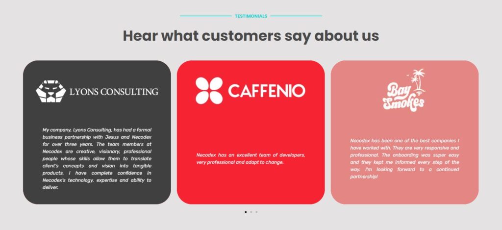
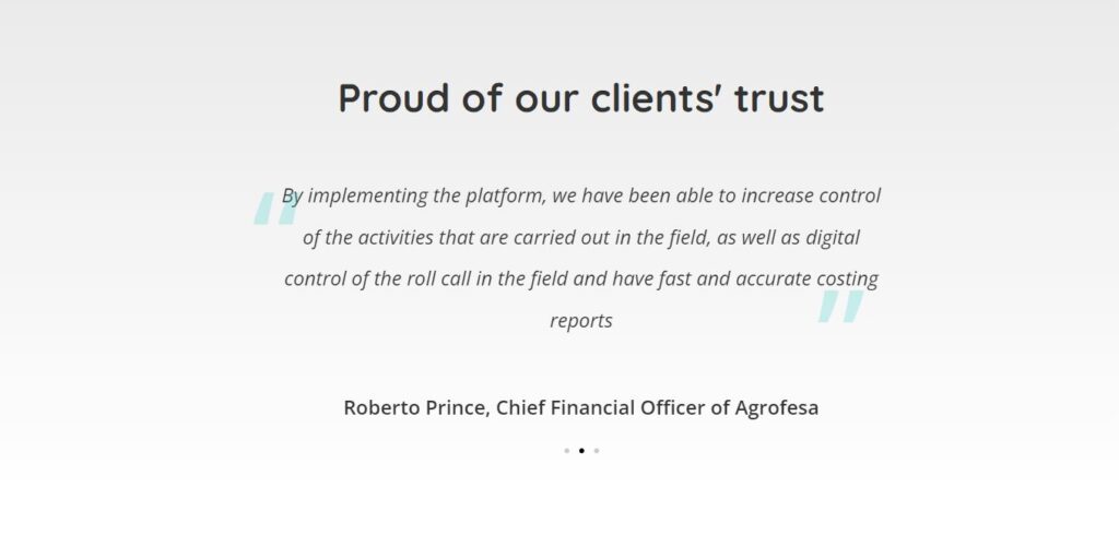
In this section, I focused on enhancing usability and visual appeal by giving more emphasis to our clients in the testimonials. To achieve this, I incorporated their logos, colors, and branding elements, creating a cohesive and impactful presentation. By showcasing our clients’ visual identities, we establish stronger connections with potential customers and reinforce trust in our services. These changes not only elevate the overall aesthetics but also provide a more engaging and memorable experience for visitors.
NEW KEY FUNCTION - STEPS AND SCHEDULE
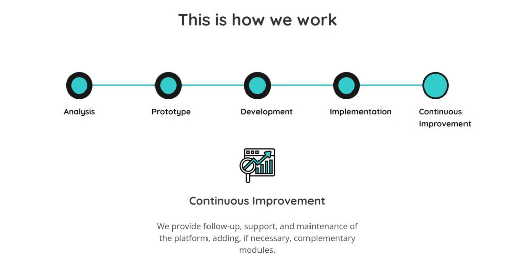
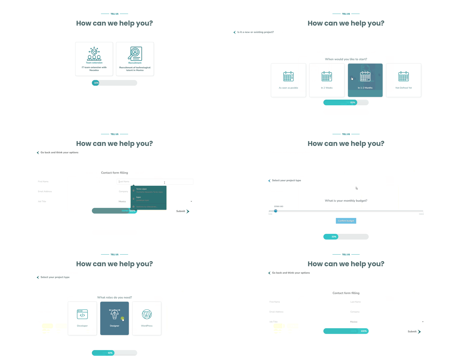
I created a highly interactive section where users can customize their business preferences. By incorporating coding, I enabled options for selecting business size, budget, and calendar requirements. Furthermore, users can conveniently fill in their data through a user-friendly form, streamlining the process for a personalized experience.
***The page is experimenting new changes so this one may have some different visual details.
